

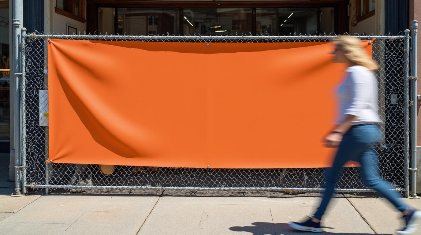
To design an effective banner, use very large letters, a few words, strong contrast and a sharp file built at final size. A common sign-industry rule of thumb is about 1 inch of letter height for every 10 feet of viewing distance, so 2 inches is the bare minimum at 20 feet. We go much bigger for the main message, because people usually glance at a banner while walking or driving past.
Below, we cover letter size, message length, contrast, file setup and the differences between vinyl and retractable banners. It's the kind of checklist our designers work through when we build banner and billboard designs for customers.
How big should the letters be for a 20-foot viewing distance?
Start with the rule of thumb: roughly 1 inch of letter height per 10 feet of distance. That gives you a legibility floor, not a target. Treat it as general guidance and confirm sizes on a proof before you print.
Here's how the rule scales:
| Viewing distance | Minimum letter height (rule of thumb) |
|---|---|
| 10 feet | 1 inch |
| 20 feet | 2 inches |
| 30 feet | 3 inches |
| 50 feet | 5 inches |
A banner gets a second or two of attention, so the headline should be several times larger than the minimum. This is how we think about each element at 20 feet:
| Element | Purpose | Sizing approach |
|---|---|---|
| Headline or business name | Read at a glance | Several times larger than the 2 inch minimum |
| Supporting line | Says what you offer | At or comfortably above 2 inches |
| Phone number or web address | The next step | Large and bold, not fine print |
| Legal or small details | Rarely needed | Leave them off and put them on your website |
If you're not sure, print the layout small and view it from a distance that matches the same proportion. If the headline still reads without squinting, you're in good shape.
How much text belongs on a banner?
Less than you think. Aim for one main message, one supporting line and one way to reach you. As general guidance, keep the headline to about seven words or fewer. If a stranger can't take it in during a short walk past, it's too long.
A simple order works well:
- Who you are or what you sell, in the biggest type.
- One benefit, offer or location cue.
- One call to action, such as a phone number or web address.
Cut anything that doesn't serve those three jobs. Long paragraphs, lists of services and several phone numbers all shrink your letters and lose the reader. If you have more to say, point people to your website. Our web design and development team can build a simple page that the banner leads to.
What contrast and color choices stay readable?
Contrast does more for distance reading than any font choice. Dark text on a light background, or white text on a dark background, holds up far better than two mid-tone colors side by side.
- Pick high-contrast pairs. Black on yellow, white on deep blue and dark navy on white are classic because they separate clearly.
- Avoid busy photos behind text. If you use a photo, add a solid panel or darken the area behind the words.
- Limit your palette. Two or three colors keep the message clean and match your brand.
- Be careful with thin fonts. Light weights and script styles blur at a distance. Choose a bold, simple sans serif or a sturdy serif for the key words.
- Leave breathing room. Space around the text helps the eye find it, so don't crowd the edges.
Vinyl in direct sun can also create glare, and colors on screen often look different in print. Ask for a proof if color matching matters, for example when your logo color needs to match other materials.
What file setup do vinyl banners need?
Build the file at the final print size if you can, or at a clean proportional scale. Use vector artwork for logos and text, because vector files stay sharp at any size. For photos, use the highest resolution you have, because a small image stretched across a large banner looks soft.
Banners are viewed from farther away than a brochure, so images can usually be lower in resolution than for small print. The exact pixels per inch depend on the banner size and how close people will stand, so ask your printer for the recommended resolution at your size. For current print options and pricing, use our online configurator.
A few file habits prevent common problems:
- Convert text to outlines, or include the fonts, so nothing swaps at print time.
- Keep important content away from the edges, to leave room for hems, grommets and trimming.
- Don't pull a logo off your website. Web images are usually too small for large banners, so use your original vector logo file.
- Save in a print-ready format such as a high-quality PDF, and check which one your printer prefers.
As for the best program to design a banner, vector tools such as Adobe Illustrator are a strong fit because they keep type and logos sharp at large sizes. The tool matters less than starting with the right file and setting the size correctly.
How are retractable banners different from vinyl banners?
Both need big type and strong contrast, but the layout rules differ because of how they're displayed.
Vinyl banners hang flat on a fence, wall or building. They can be wide and horizontal, so a long business name can fit on one line. Wind can be a factor outdoors, so keep important text away from hems and corners.
Retractable banners stand upright, usually indoors at events, lobbies and counters. Plan for these points:
- Put the headline and logo in the upper two thirds, at eye level. The bottom is often near the floor or hidden by furniture.
- Keep key details clear of the area near the base, where the stand housing can cover artwork. Check the template for the exact stand you order.
- Use a tall, vertical layout with one clear reading path from top to bottom.
- Never put a phone number at the very bottom, where people can't see it.
What are the design tips for the perfect banner?
Most weak banners fail in the same few ways: too many words, low contrast, pixelated artwork and a weak call to action. These tips fix each one:
- Lead with one message. Choose a single idea and make it the biggest thing on the banner.
- Size for distance first. Work out the 1 inch per 10 feet minimum, then go larger for the headline.
- Build a clear hierarchy. Headline first, supporting line second, contact detail third.
- Use your brand consistently. Your logo, colors and fonts should match your other materials.
- Choose bold, simple fonts. Limit yourself to one or two typefaces.
- Keep the call to action specific. One phone number or one web address is enough.
- Check a proof. Read every word, and look at color and edge placement before printing.
Some people ask about the 7 rules of graphic design. There's no single official list, and different teachers use different ones. For banners, we lean on hierarchy, contrast, alignment, spacing, repetition, simplicity and brand consistency. If your logo isn't ready for a banner, our logo design service can sort that out first.
What do we do differently when you order a banner from us?
Our designers are human, and we never use AI. A real person checks the size, contrast and layout against how your banner will actually be seen. We also print on our own press in Miami, so the people designing your file are close to the people printing it. That makes it easier to catch a resolution or placement issue before it becomes a printed mistake.
Here's what else you can expect:
- A 72-hour turnaround.
- 100% copyright ownership of your design.
- A real person to talk to, and we're open 7 days a week.
- Experience from about 25,000 customers served, plus 3,662 reviews across Google, Trustpilot and Facebook. That includes 1,745 Google reviews with a 5.0 rating.
If your banner is one piece of a bigger brand refresh, our studio overview shows how design, web, print and marketing fit together.
A simple checklist before you send a banner to print
- Can the headline be read from 20 feet when viewed at scale?
- Is there one message, one supporting line and one call to action?
- Do the text and background have strong contrast?
- Is the logo a vector file, and are photos high resolution?
- Is important content safely away from the edges and, for retractables, the bottom?
- Have you checked a proof for color and spelling?
When you're ready to turn this into a finished banner, start with our banner and billboard design page.

|
3 weeks ago
|

