

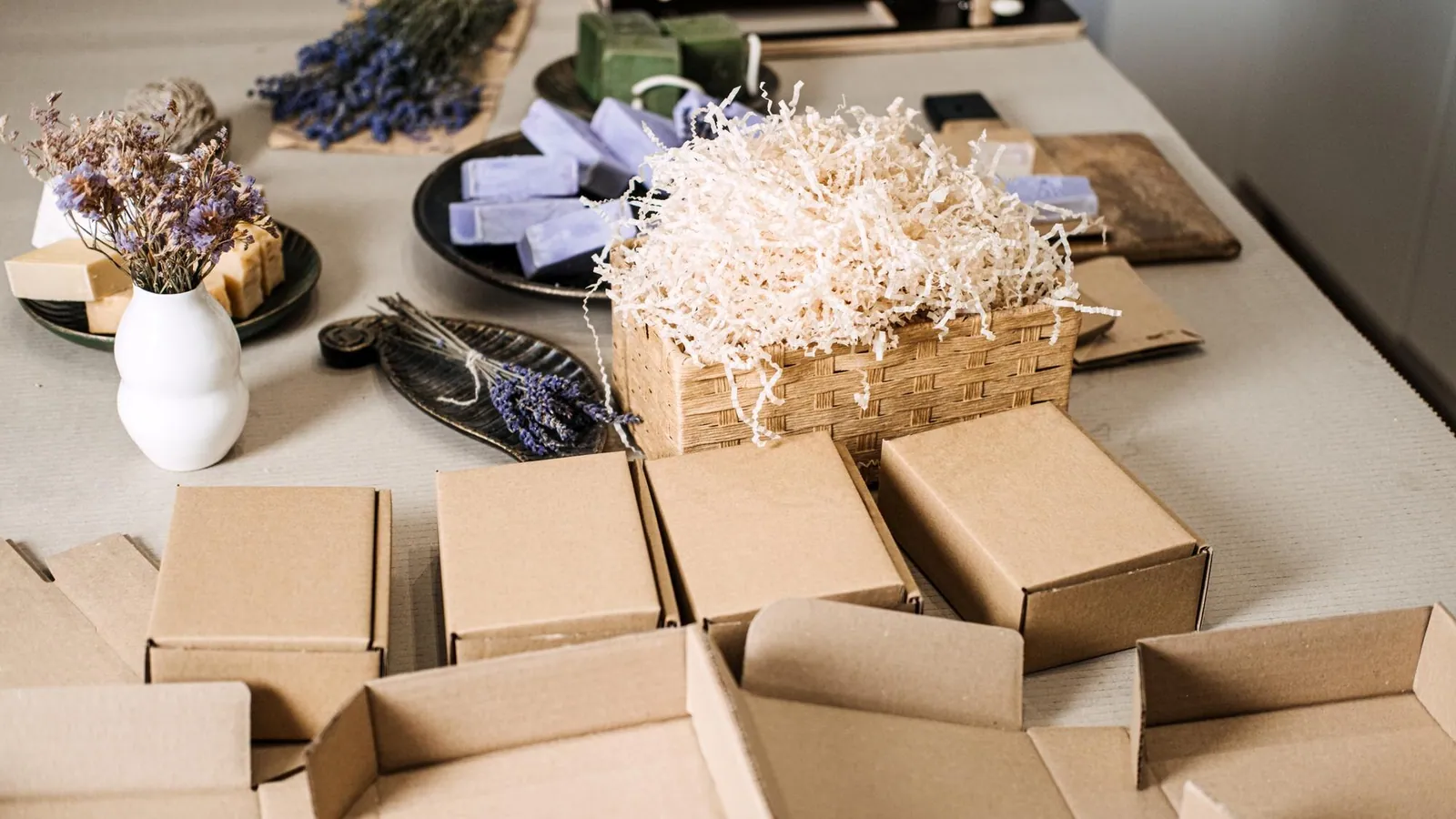
The product packaging design process runs in seven steps: brief, structure and dieline, concept, artwork, prototype, print production and a shelf check. The dieline comes early because it sets the exact size, folds and print areas that every design decision depends on. If you skip it or treat it as an afterthought, you'll end up redrawing artwork later.
Below we walk through each step in plain terms, with the mistakes we see small businesses make and what to ask for at each stage. If you'd like help with the full job, our product packaging design service covers it from first sketch to print.
What are the steps in the product packaging design process?
Every packaging project is a little different, but the order rarely changes. Here's the sequence at a glance.
| Step | What happens | What you end up with |
|---|---|---|
| 1. Brief | Define the product, buyer, price point and where it will be sold | A one-page summary everyone agrees on |
| 2. Structure and dieline | Choose the package type and size, then build the flat template | A dieline with folds, cuts, glue areas and bleed |
| 3. Concept | Explore layout, color, type and imagery | Two or three design directions |
| 4. Artwork | Build the chosen design on the dieline | Print-ready files |
| 5. Prototype | Print or mock up a physical sample | A real box, bag or label in your hands |
| 6. Production | Final proof, then the print run | Finished packaging |
| 7. Shelf check | Compare it to neighbors and test it in real conditions | Notes for the next order |
The rest of this post explains what to watch for in each one.
What goes into a good packaging brief?
A brief keeps the project from drifting. It doesn't need to be long, but it should answer five questions in writing.
- Who buys it? A gift buyer, a busy parent and a contractor ordering supplies all respond to different cues.
- Where is it sold? A retail shelf, a website, a farmers market table and a shipping box each put different demands on the design.
- What must it say? Product name, key benefit, size or quantity, and any legal text for your product category.
- What are the limits? Budget, order quantity, number of ink colors and any size limits from your retailer or shipper.
- What already exists? Your logo, brand colors and fonts.
That last point matters more than people expect. Packaging works best when it sits on top of a finished brand, so if your logo is still rough, settle that first. Our logo design service is a good starting point, and our logo packages run from $100 to $300 depending on the scope.
Labeling rules differ by product type, such as food, cosmetics, supplements or household chemicals. Check the requirements for your category before design starts. For food products, the FDA's food labeling and nutrition guidance is the place to begin, and it will tell you what has to appear on the package. For other categories, look up the agency that covers your product, and don't rely on a designer to know every rule for you.
What is a packaging dieline and why does it come first?
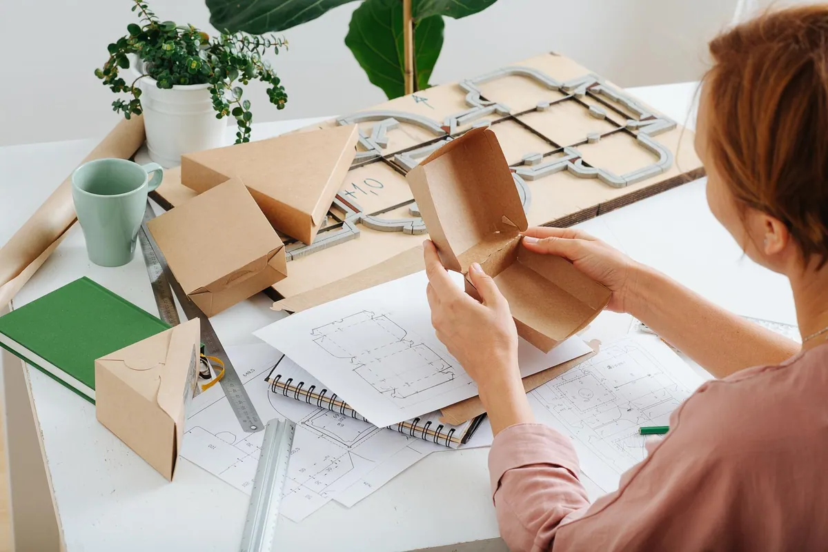
A packaging dieline is the flat, unfolded outline of a package. It shows every cut line, fold line, glue flap and the area where artwork can sit. Think of it as the blueprint: the design is only correct if it fits the blueprint.
A working dieline usually marks these things:
- Cut lines where the shape is trimmed.
- Fold or score lines where the material bends.
- Bleed, the extra artwork that extends past the cut so no white edge shows if the trim shifts slightly. Many printers ask for about 0.125 inch (1/8 inch), but confirm the number with yours.
- Safe zone, the inner margin where text and logos stay clear of the edges and folds, often a similar 0.125 inch or more.
- Glue areas, which usually stay free of ink or coating.
Build or confirm the dieline before any artwork starts. Stock sizes are cheaper and simpler, while a custom structure can suit an unusual product but takes more planning. Either way, the printer who makes the packaging should confirm the dieline specs, because small differences in material thickness can change how a fold behaves.
How do you move from dieline to a design concept?
With the structure fixed, you can explore the look. Good concept work starts with hierarchy: what should a shopper see first, second and third from an arm's length away?
For most products, that order is brand, product name, then the one benefit, flavor, scent or variant that tells similar items apart. Everything else, such as ingredients, directions and barcodes, belongs lower and smaller.
A few practical habits help at this stage:
- Look at the products that will sit next to yours, online or in person, and decide whether you want to stand out or fit in.
- Design the front panel first, then extend the system to the sides, back and top.
- Plan a color system for variants early, so a second flavor or size doesn't mean starting over.
- Ask for two or three directions, not ten. Fewer, clearer options make better feedback.
Having a human designer matters here. At The Business Toolkit, our designers are real people and we never use AI to make your packaging, so the concept responds to your product and your buyer instead of a generic pattern.
What makes artwork print-ready?
Print-ready artwork is where a lot of projects stumble. The design may look great on screen and still fail at the press because of technical details.
Before sending files to print, check these points:
- Artwork is built on the final dieline, with bleed and safe zone respected.
- Images are high resolution and placed, not stretched. A common target for printed images is 300 pixels per inch at final size.
- Fonts are outlined or embedded.
- Colors are set up for the print method, since screen colors and printed colors rarely match exactly.
- Barcodes are large enough to scan and have clear space and good contrast around them. If you plan to sell through retailers, GS1 US is the organization that issues standard product barcodes.
- Any text required by law or by your retailer is present and readable.
If you're printing on a specific stock or finish, or adding special effects, ask how that affects color and detail. A matte surface and a glossy one can make the same ink look noticeably different.
Why make a prototype before the full print run?
A prototype is the cheapest place to find mistakes. A flat PDF can't tell you whether the box closes properly, whether the product fits, or whether the text wraps awkwardly around a fold.
When you have a sample in hand, check it against five questions:
- Does the product fit with the right amount of room?
- Do folds land where the design expects?
- Is the text readable at a normal reading distance?
- Does the color look right in daylight and in store lighting?
- Does it survive handling and, if you ship, a trip in the mail?
Fix what you find, then approve a final proof. Changes after a full run are far more expensive than changes at this stage.
What is different about working with The Business Toolkit?
We're a design and marketing studio in Miami with our own print press, so the people shaping your artwork work alongside the people who print it. That shortens the loop between a design question and a production answer, such as whether a fine detail will hold up on a chosen stock.
A few things you can count on, as described on our product packaging design page:
- Human designers, never AI. Every design is made by a person.
- 100% copyright ownership. The finished work is yours.
- Printed on our own press in Miami. Print pricing is available through our online configurator.
- Talk to a real person. We're open 7 days a week.
We've served about 25,000 customers, and our reviews total 3,662 across Google, Trustpilot and Facebook. That includes a 5.0 rating from 1,745 Google reviews and 1,176 reviews on Trustpilot. Reviews don't replace a look at your own project, but they show how we work with clients day to day.
How do you check that the packaging works on the shelf?
Once the packaging is printed, test it in the setting where it will actually be sold. Put it next to competing products, step back a few feet and see what stands out. Photograph it as well, since many buyers see your product first on a screen.
That last point connects packaging to the rest of your marketing. The same colors, photography and wording should carry over to your product pages, so it helps to have a site that matches the box. If that's on your list, see how we build and manage websites.
Keep notes from the first run: what customers said, what was hard to read, what got damaged in transit. Those notes make the next order better.
When you're ready to turn a product into packaging, start with our product packaging design page and talk with our team.

|
6 days ago
|
